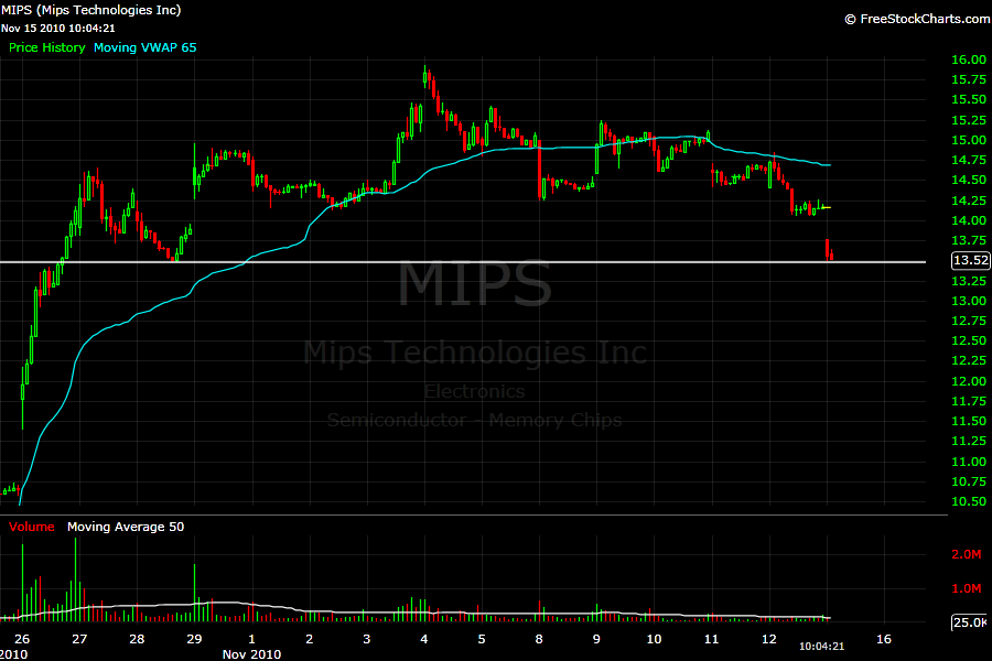
How I lost money in $MIPS

Risk appetite is a function of recent portfolio’s performance. Exited by the acquisition of $ISLN which has been a sizable position in my holdings for a while, I went to chase setups where I don’t really have an edge. I decided to open a small pilot position in a stock that was declining towards its rising 20-day MA and a previous zone of support. It was a make or break moment for the stock. The logic was that I risk 10 cents with the potential to make at least 30-40 cents.

The loss was tiny, but this is not the point. Even if the trade was profitable, the process was wrong. This is a flashing warning light for me. Such type of behavior leads to the building of bad habits. I should stick to setups, which underlying psychology I understand well and I have been consistently profitable trading them.

Best Performing Stocks YTD – Part 2

The best performing stocks in any given year are usually the ones that surprise the most frequently and by the highest margin. Powerful price trends are sustained by a sequence of catalysts. Under the surface, all catalysts are earnings related.

In the previous post, I pointed out that a big number of the best performing stocks are neglected price-wise and volume-wise in the beginning of their trend. Most market participants miss the first stage of the move by focusing only on highly liquid stocks, without understanding that liquidity often follows price when there is a catalyst involved.

There are different type of buyers at the various stages in the price cycle of one stock. Earnings related catalysts (earnings reports, new contract, move in the underlying commodity…) have the potential to change perceptions of value and to start a process of major repricing – the beginning of a new trend or the acceleration of an already existing one. The first buyers believe that their expectations for strong earnings growth will one day materialize into strong price growth. This is why they are not afraid to buy low liquid stocks.

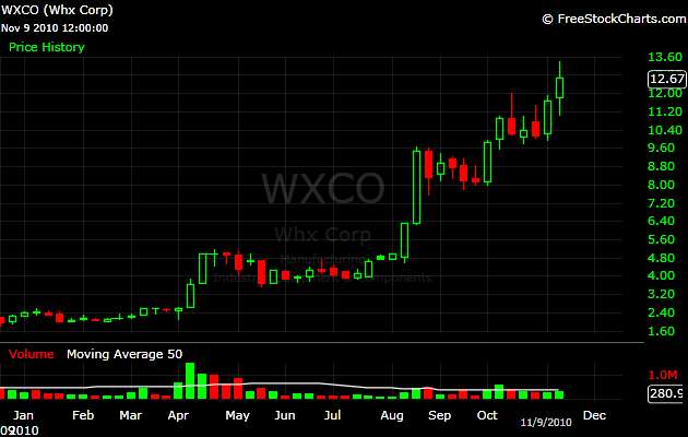
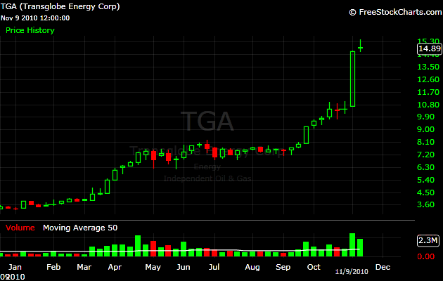
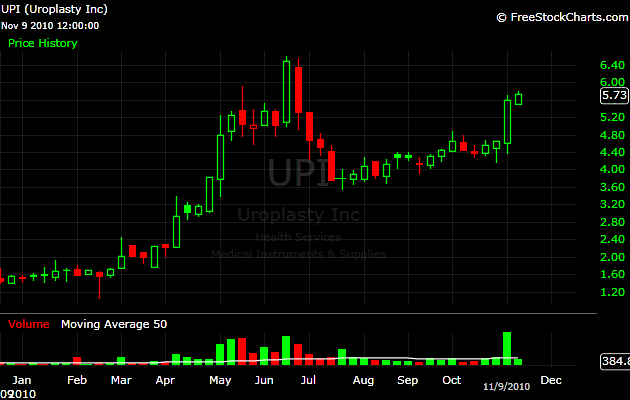
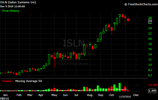
After the initial run, a typical stock will consolidate and form what many call a bullish flag or wedge. This is the stage when this stock will be caught by the scans of technical traders and they will get involved, further exacerbating the liquidity. Technical traders assume that someone knows something about the company and this is why the underlying stock is accumulated. They might not be right, but when enough market participants act on their beliefs, their expectations turn into a self-fulfilling prophecy and the stock breaks out from the bullish pattern, further attracting fresh capital. At some point, the enthusiasm of the buyers will fade out. This is the make or break moment for the stock. If another fundamental catalyst does not appear, the trend is short-lived and the price turns south. This is why in the beginning of this post, I highlighted that strong price trends are sustained by a sequence of catalysts.

In the middle of their price trend, most of the future best performing stocks look overextended. Most market participants will ignore such stocks because they are up “too much, too fast”. In capital markets, what feels irrational is often the right thing to do.

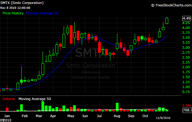
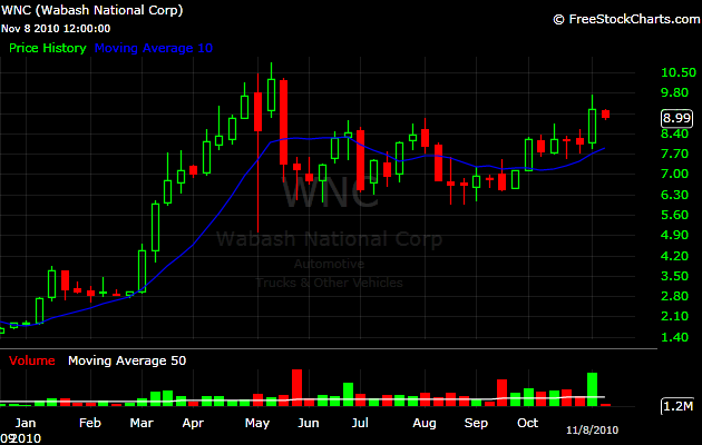
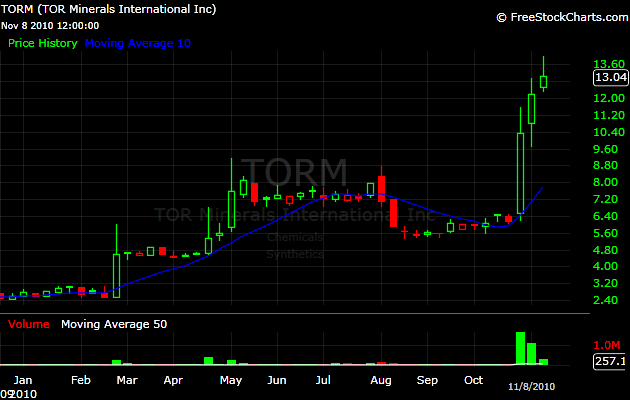
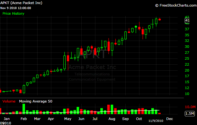
Let’s take a look at the weekly charts of another five stocks that shined during the year:

Best Performing Stocks YTD – Part 1

It is this time of the year again, when we could look back at the best performing stocks YTD and try to reveal the catalysts behind the biggest moves. I do this on a regular basis, using different time frames. There is no better way to learn about the underlying forces that create and sustain powerful price trends. Based on my findings, I created screens that help me to spot future price winners in the making.

As of tonight, there are 166 stocks that more than doubled ytd and are currently trading more than 100k shares daily. Let’s take a look at the weekly charts of the five best performing stocks:
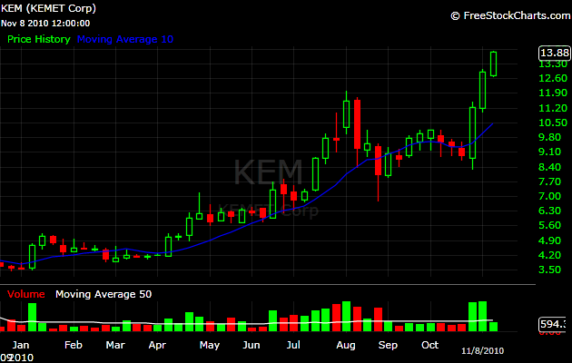
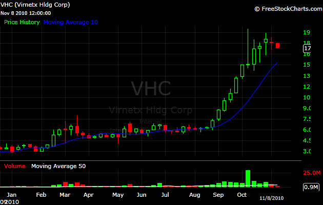
Today we will examine the trends just from a technical perspective. In the following posts, we will dive deeper and look at the catalysts and the psychology behind the price moves.

What were some of the common features between the above mentioned stocks, before they went to make their monstrous moves?

1) Sudden range expansion (in the example of $TORM, from 50 cents weekly range to $3.50 weekly range)

2) Volume expansion (in the case of $TORM, from 5000 traded shares per week to 200k, a 20 fold increase). As the price moves higher, liquidity improves.

3) The five stocks were below $5 in January. Under $5 stocks are under the radar and often neglected volumewise.

What were the most obvious common features between the five stocks in the middle of their moves?

Well, all stocks that appreciate more than 300% ytd, are up only a 100% at some point in the year. Not every 100% move will turn into a 300% move, but relative strength plays a huge role in revealing the best performing stocks ytd. The strong get stronger.